Monday, October 22, 2007

mission accomplished!

IT IS COMPLETE!!!!


Hopefully you enjoy the website as much as I do! :) It was a great experience to create and I will expand my knowledge on Adobe Flash and also website designing.

Thank you for teaching us!

Sunday, October 21, 2007

The final website - nearly done!

A screenshot of the website: work in progress.


I never knew how much  I can/will learn of Flash within this course. It is amazing. A bit frustrating with the scripting, but nevertheless, exciting to see what you have created in the end.

I didn't have enough time to produce the number of animations/video clips within the flash space for the rollovers and also the images in the external links as I wanted. But hopefully, the layout and its contents makes up for my website.

Thursday, October 18, 2007

flash issues >.<

Remind myself to never make anything related or anything near to moving like a pair of doors in Flash EVER. Again.

Actionscripting is a bit of a pain, but making this site has been very enjoyable so far! I have got most of the graphics collected and edited, except for the main page inside pages. I'm trying to keep the serious face on the main index page. (not the enter page with the rabbit)

With a bit of outside help, I needed to go into levels in actionscripting and also the addition of one test for opening and closing the doors with different backgrounds....

Never again... seriously.

(Wow, Kelly Clarkson song hahaha)

Saturday, October 13, 2007

Final website - WIP (work in progress)

I finally got the basic skeleton of the website going with flash. I have the visual elements that would be included for the main site and also parts of the secondary pages (internal and external links.)

Will need to reference a few artists for their photographs, works and etc. I needed help with the actionscript step with the doors. So with a bit of outside help, I got the doors to open and close as an action with the navigation bar.

To enhance the artistic touch, I wanted to add more pieces of art in the background like framed paintings.

Now I'm experimenting with an old fashioned font and also traditional background wallpaper textures.

Hopefully this is going alright! >_<

Tuesday, October 9, 2007

Main project - relation to space

My website would be created in a virtual space, with photographic images used to give it an abstract touch. It's going to relate to space as it is a medium to let the viewers enter into different spaces.

Each space would be represented by a different "level" on the elevator buttons (navigation bar). So the different spaces would be:
1. very cramped space
2. very open space
3. perfect space
4. outer space (for a comical touch)

I want to press on the idea of creating the website with an elevator appearance as it is a MEDIUM for traveling to different spaces. To enhance this medial appearance, I decided to make this into a flash website. So whenever the viewer clicks on a button on the navigation bar, the elevator doors on the right, would open and close like a normal lift. A possible audio sound of  "ding!" will be heard everytime you click.

There will be elevator music in the background to give it a sense of irony and atmosphere. The main page, the elevator doors would open to a welcome page. Then for spaces, there would be a page for "about," "works," and "affiliates/links."

So everything apart from the navigation bar (centre left) and the elevator doors (main text area - which would be centre-right) would be layered with modern/abstract graphics or white space.

It's going to an artistic website designed for photographic space experimentation and artistic identity. This would contain information on what space is, and what art could do to fill up space. So for copyright issues, I shall put in my own artworks and photographs in as the content. This can be somewhat of a portfolio yet a unique website on my own interpretation of "space."

Monday, October 1, 2007

Interesting site

http://www.simonemoreno.com/

I loved how they used the colour black and white here along with the simple touches of vectors on the left to present the artistry of the site.

The use of space is what I'm hoping to accomplish with my website as I'm hoping to create it infront of a large photo, such as this site. I dont want to lose both the text and the background image's impact on the viewers, so hopefully I can use this website as a guidance for designing and creating my site.

I love the rollovers for this website. It's so simple yet so effective as an interactive tool in creating a website. I would like to create the same effect on my navigation bar as it does have similar colours and font already. I would like to keep my design simple and easy to navigate around the site without much confusion, data loading and eye appeal.

I know I won't be able to create the main text area to move as much as it does for simone moreno's site, but I would like to keep this design of space use and the collaboration with text and large images.

Saturday, September 29, 2007

Final idea

Okay my website would be based on the idea of being in an elevator. There will be four levels (4 links/pages) on this website.

So I would like to make the navigation bar to be based on the elevator buttons and the main window framed with the elevator doors.


Here is a screenshot of what I have created so far. I'm getting there with the amount of layers most likely needed with flash. I would like to make the doors open and close each time a button is pressed by the user, to make it more relevent to my idea.

So in the main window, each page would have a different photo of me in a different space. I have thought out the different images already:

1. Me cramped into a small space
2. Me standing in a large open space
3. Me in a perfect space (i will have my arm raised to match the space's width)
4. Me flying in space

I want theses images to have a white space in the background, so all of these photos would be taken in a white environment and edited for space exaggeration and focal points. The photos would be taken by a friend of mine and would be posted up very soon! So with these photos this would be my focal point of representing the theme "space."

-----

I know this is really random but this is a really cool flash website showing alot of cool animations with claymation and drawn-based characters:

https://www.zune-arts.net/

Wednesday, September 19, 2007

New idea

Beginning of a great idea! This completely blew me away and I'm so going for it! Here is my first sketch of my idea. Sorry of the lack of proper detail and depth.


I figure that I would be much disadvantaged if I would continue with my previous idea of a page-turning journal. And also I lacked the contents and images I would like to place into my website. So it was clearly a deadend.

This went on for 2 weeks without proper inspiration, till now. I started afresh. I want to create an artistic website based on different spaces with myself in them.

Wednesday, September 12, 2007

inspiration???

http://www.jkrowling.com/

ONLINE JOURNAL OF J.K. ROWLING!! I love the setting! I love how everything is so interactive and neat! This is quite how I want to make my website. But my god, Flash/maker barrier at the moment....

This is so cool.....

Going to refresh my memory on how to make rollovers with Flash @___@ and possibly learn how to do that whole 'target' text into the main object if possible .....

Wednesday, September 5, 2007

Flash afterthoughts....

Starting to rethink my priorities for making my site. Not sure about using the flash element. May possibly add a small flash section like the menu/navigation bar. >__<

I'm starting to collect artworks and projects that I would like to present on my website. This is picking up with a few of my digital photographs and also digitatl artworks.

So the webpages for contents are being built up and neatened with a touch of css. (additional style sheet.)

Tuesday, August 28, 2007

The reactions

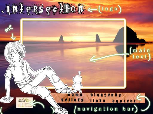
Positive reactions to the graphics used in this prototype. But how it relates to space is not very clear. I would need to rethink the main objective/focus of the website that would represent "space" somehow.

Eva and Spencer suggested that I change the background of the website. But when I presented the idea that the background would change after each click on a link (a different background for each link of the website = 5 backgrounds), they said to somehow improve the navigation bar to relate more to its surroundings.

So the design of the navigation bar is indeed of redesigning and focus. The idea of the background rolling over the previous one, is encouraged, but the music audio player isn't. Eva suggested that it would be very hard to create with Flash. So I would need to create it with HTML and emboss it into one of the pages (most likely the main home page).

So far, everything about this website is based on flash. But now the idea of using HTML Div tags have been suggested by Eva, which would be useful indeed.

Overall, with my current prototype, I really want to redesign it from scratch. I would love to create something simple and effective at the same time, still built by Flash. I am not sure whether I should keep my digital character as I really like from an artist's POV.

Note: The screenshot I posted up earlier did not have completed graphics aka. the navigation bar is not going to look like that, but be created in that position of the layout. Also the frame of the main text will be changed to be more adaptable to the different backgrounds. 

But this would be thought more of. Till then, here are the results. :)

Sunday, August 26, 2007

Screenshot of 1st concept :)

moar sites oh wow.... Website Design Process 2

http://saizenmedia.com/fubon1/

I love how there is so much interaction within this site! I would love to create a site that allows music to play while loading it (percentage of page loading is a MUST now!) A media player with the a volume control would be awesome.

Also I would love to learn how to make the effect of turning a page with flash. So this would create the illusion of actually being in a fantasy book.

http://eng.s-inc.com/hnaoto/

Use of the black/white/red colour scheme is VERY eye-catching and appealing. Lovely rollovers and photos in advertising their japanese clothes brands.

http://www.beyonceonline.com/

I just found the use of flash elements put into html pages. Very suave but I don't know, this site was a bit of a pain to load due to its data size.

http://www.mikasounds.com/uk.php

Great use of colour and vectors! Clearly represents Mika's cheery personality within most of his songs as they are pop-ish and very catchy. PHP pages but with flash elements too! Very snazzy.

http://www.thebourneultimatum.com/

God, I love this film but its website blows me away. Use of rollovers (look at the codes!!!) and the continuous video background, was very cool and high-tech at the beginning, but after a while it got a bit annoying. Love the use of the timeline on the bottom.

--------

Conclusion:

With these websites as inspirations, I am definitely heading towards making a flash-based website. I am going to put a large photo in the background and code it to transform/translate side to side to the user's mouse movements.

Navigation bar will be on the bottom. Sparkly/glowy rollovers are being created in my mind. The main text area would be like a stage or be a flowery textured framed. My main character would be sitting on the bottom left corner of the website 24/7 and looking cute.

Now, I shall be off to do a PSP sketch of this idea. Wish me luck! :)

Saturday, August 25, 2007

Website designing process 1

Okay, so the theme for our websites have to be on "space." So now i have decided to use this theme on the environmental factor of creating my website.

I have thought of two ways of approaching this. One, would be making the background of the site, continuously moving/rotating as the main area of the navigation bar and information would remain still. Two, making the background stationary as the main area of navigation and data would be moving and interactive to the user's mouse movements.

The pages of the website have been decided:
- Enter page (Splash page)
- Main
- Biography
- Gallery/Projects
- WIP (works in progress)
- Links/Affiliates
- Contacts

What would be in the gallery is still undecided. But currently, it is leaning towards the idea of presenting my past photographic, CG and animation works created in my leisure and university time.

Tuesday, August 21, 2007

Test our braincells!!

Last week we had to create the basis of a website with the given images. My slicing in PS has improved alot but I forgot quite a few things in Dreamweaver. But overall, I think I did okay.

Anyways, this week, hope your head gets better Gianni!!!!!!!

During the weekend, I started to do a few sketches and ideas on what my final website would look like. So far I would like it to be flashbased and graphic-orientated. I would like to include a few of my own personal CGs in this website as a personal touch.

This website caught my eye and sent my heart swooning to see the film soon!

http://www.stardustmovie.com/ Can't wait for it to come out! So much flash and interaction = the awesome.

Also this artist from deviantart. Great photos + flashsite :)

http://www.werol.org/

Wednesday, August 15, 2007

Some websites...

A few good links and inspirational sites I find interesting...

http://www.whitedawn.com/
http://www.vicvic.co.nr/

http://www.arcostudio.com/

all users from deviantart.com :)

Saturday, August 11, 2007

Beginning of Webart&design

Hello! This is Christie Lee. 2nd Year of Design Computing @ USyd. This will be my blog for my elective "AWSS2028 Web Art and Design."

Well, as a start I did my presentation on the website www.crisvector.com. This is an online CV for a Brazilian digital artist. I found this artist on www.deviantart.com as I am also a fellow deviantart member, and a great fan for digital art. He has been an inspiration to me for some time and so this was a great opportunity for me to present to the class some of his works.

The layout of the website is very structural and set up to become a professional outlook on this man's digital arts and works. It was designed and created in Flash and the website is capable of being loaded with a slow internet speed and also on different browsers ranging from Internet Explorer, Mozilla Firefox and Safari. This website is very convenient and capable to set out its purpose of presenting his artworks.

There is an index page that leads the viewer to his profile, affiliates, artworks, references and others. The use of automatic header/footers that labels each of his artworks, and what tools he used to create it, gives a sense of professionalism and clarity towards the viewers. Simple pastel colours for the layout and arial-like font expresses a touch of cleanliness and punctuality in his personality.

The targeted audience would probably be fellow artists and possible future company producers who would look to hire a digital graphic artist and may want to see a few of his online works. The links of "Shop" and "Contact" is always present on the website, under the logo of "crisvector" on the topleft. It being in that position is the first and clearest place for the user to find the links.

I love this website because it is straightforward and it is a representation of how digital art and design can collaborate and create a very professional yet artistic website for all the viewers to see and share in the online world.